

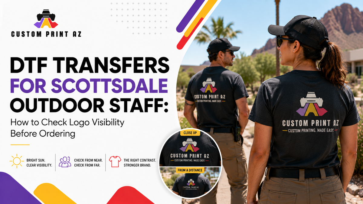
A logo can look clean, balanced, and professional on a computer screen. But once that same artwork moves onto a T-shirt, polo, or other branded garment worn by staff, it may be perceived differently. Garment color, outdoor lighting, and the distance from which people see the logo can reveal visibility problems that are easy to miss on a screen.
That is why businesses planning outdoor staff apparel should ask more than, “Is the design correct?” before ordering DTF transfers. A more useful question is: Will this logo be easy to recognize in the conditions where the garment will actually be worn?
This is not a guide to designing a logo from scratch or setting universal minimum font sizes for DTF printing. Instead, it focuses on a practical final review: checking prepared branded artwork in a context that is closer to real-world use before approving it for production.
Looking Good on a Screen Is Not the Same as Being Visible on Apparel
When artwork is reviewed on a computer, it is often enlarged, centered on the screen, and viewed with full attention. Outdoor staff apparel is rarely seen that way. Employees may be moving, customers may be several steps away, and the garment may be viewed from different angles throughout the day.
For that reason, it helps to separate digital artwork approval from real-world visibility review.
The first question concerns the file itself: Is the correct logo being used? Are the required elements present? Is the artwork generally ready for production? If those fundamentals still need attention, Custom Print AZ's DTF transfer artwork preparation guide covers broader design and file-preparation considerations.
The second question is different. Once the artwork is prepared, you need to decide whether it performs its intended job on the actual garment. That is where garment color, contrast, lighting, and viewing distance become useful approval factors.
Start by Defining What the Logo Needs to Do
Not every branded garment has the same communication goal. On some staff shirts, the main purpose may be helping customers recognize an employee quickly. On others, the goal may simply be making the company logo clearly visible. Some designs may also include a slogan, service description, website, or other secondary text.
Before evaluating visibility, decide what the artwork needs to communicate first.
For example, if the main goal of a customer-facing staff shirt is immediate brand recognition, small secondary text may not need to be readable from several steps away. The primary logo or business name may be much more important. If that secondary message is essential, however, it deserves its own readability check.
A useful starting question is: What should someone notice first when they see this garment?
The answer creates a clearer standard for the rest of the review. Instead of expecting every element to have equal visual weight, you can judge whether the most important element remains noticeable in actual use.
Evaluate the Logo and Garment Color Together
Artwork should not be evaluated only against a white design canvas or transparent background. On the finished apparel, the garment becomes the visual background, and the same logo can appear very different across different garment colors.
The key issue is contrast. Does the main logo shape, business name, or other identifying element separate clearly enough from the garment underneath it?
A logo may appear strong on one shirt color and less distinct on another. That does not automatically make the artwork unsuitable. It simply means businesses using the same design across multiple garment colors should review each combination rather than assuming one approval applies to all of them.
- View the artwork on the actual garment color you plan to use.
- Check whether the main brand element is obvious at first glance.
- Look for important areas of the logo that visually blend into the garment.
- Consider whether secondary text or decorative details compete with the main identity.
- If several garment colors are planned, review each color separately.
The goal is not to perform a formal color-theory analysis. It is simply to catch an obvious visibility problem before the artwork becomes part of a production order.
Why an Outdoor Check Makes Sense in Scottsdale
Outdoor visibility is particularly relevant to the Scottsdale use case. The City of Scottsdale's official city profile reports an average of 314 sunny days.
That fact is not evidence about the durability of DTF transfers in sunlight, and this article is not making claims about UV resistance, wash life, or transfer longevity. The issue here is visual perception: how branded apparel looks to people in bright outdoor conditions.
For customer-facing or outdoor staff, it can therefore be useful to look beyond an indoor monitor and review the planned artwork on the target garment color in both brighter outdoor light and shade.
This does not need to become a technical lighting test. You are simply comparing the artwork under realistic conditions to see whether a meaningful visibility problem appears.
Compare the Same Artwork in Bright Sun and Shade
An outdoor garment will not remain in one lighting condition all day. Staff may move through direct sunlight, covered entrances, shaded patios, parking areas, or indoor and outdoor spaces.
If possible, look at the artwork on the intended garment color in at least two conditions: brighter direct light and shade.
Start with a quick glance rather than immediately inspecting tiny details. What attracts your attention first? Is the main logo easy to identify? Does the garment provide enough visual separation from the design? Does another element unexpectedly become more prominent than the brand itself?
Then look more closely at the secondary text and supporting details. If the primary identity remains clear when the lighting changes, that is a useful sign. If an important part of the artwork seems to disappear against a certain garment color or becomes difficult to distinguish, it is better to catch that before ordering transfers.
This is also why universal rules such as “always use this color in sunlight” are not very useful. Every logo, garment color, and artwork combination can behave differently. Reviewing the actual combination gives you more useful information than relying on a generic formula.
Separate Close-Up Readability From Distance Recognition

Not every element in an apparel design needs to be equally readable from the same distance.
A customer speaking directly with an employee may be able to read smaller wording on the garment. The same employee viewed from several steps away will usually be recognized first by the larger logo, business name, or main visual shape.
Check the Artwork Up Close
At close range, review smaller typography, slogans, and supporting information. Does the text still communicate what it needs to communicate without fighting against the rest of the design?
There is no reliable reason to invent a universal minimum font size here. Typeface structure, garment color, artwork density, and final print size can all affect readability.
A better question is whether the information is necessary and whether it remains understandable in the normal situation where someone would realistically read it.
Then Check Recognition From Several Steps Away
The purpose of a distance check is different. You are not trying to read every small word. Instead, ask whether the main brand identity is still easy to recognize.
If the design only makes sense when viewed from very close range and the primary logo disappears into surrounding detail from farther away, the artwork may deserve another review before it becomes outdoor staff apparel.
This distinction is especially useful for artwork containing multiple messages, small labels, decorative details, or secondary graphics. Just because an element exists in the source artwork does not mean it needs the same level of emphasis on a staff garment.
View the Artwork Close to Its Planned Physical Size
This is not a DTF transfer size guide, but continuously reviewing an enlarged image on a monitor can make it difficult to judge how the design will feel on a real garment.
Before final approval, try to view the artwork close to its intended physical size. Depending on your workflow, that could mean using a reasonably scaled mockup, a full-size paper reference, or a sample garment when one is available.
None of these methods should be treated as a guarantee of the final DTF result. Their purpose is simply to move the decision away from a dramatically enlarged screen view and closer to the actual visual scale of the apparel.
At this stage, focus on three questions: Does the primary logo still have enough visual presence? Do smaller elements create unnecessary clutter? Does the garment still communicate the intended brand identity at the planned size?
Ask Whether Secondary Text Is Really Helping
More information does not always create better visibility on outdoor apparel. A logo may be accompanied by a slogan, phone number, website, service description, location, or other supporting copy. Those elements can add information, but they can also reduce the visual emphasis of the main brand.
That makes the purpose of secondary text worth reviewing, not just its size.
If removing a small element would not change the primary job of the garment, a cleaner version may be easier to recognize outdoors. That does not mean every logo should automatically be simplified. The decision should depend on the purpose of the apparel and the importance of the information.
If the core logo or business name already performs the primary identification job, supporting information can be evaluated based on whether it genuinely adds value in that viewing context.
Do Not Assume One Approval Covers Every Garment
A business may use the same artwork on a dark T-shirt, a light polo, and another staff garment. In that situation, approving one mockup and assuming every combination will look the same can create avoidable surprises.
You do not need a complicated approval system for each item. Simply review the actual planned combinations and repeat the important questions: Is the primary logo visible? Is there enough contrast? Does the design still work up close and from several steps away?
If one combination performs well and another does not, the issue may be the visual relationship between the artwork and the garment rather than the DTF transfer itself.
Making that distinction before ordering gives you a more informed production decision than approving artwork in isolation.
If You Find a Problem, Avoid Inventing Universal Technical Rules
When a visibility problem appears, it can be tempting to look for a single answer such as a required font size, line thickness, or percentage increase. Without a verified production specification, those numbers should not be presented as universal DTF rules.
It is usually more useful to describe the actual problem first.
For example: “The business name does not separate clearly from this garment color,” “the secondary wording becomes visual clutter from several steps away,” or “the main logo is not the first thing people notice.”
Once the problem is specific, the artwork can be reviewed for contrast, information density, hierarchy, or unnecessary elements. The goal is not to make the design larger or simpler by default. The goal is to address the visibility issue you actually observed.
Make One Final Real-Use Check Before Ordering
The final decision does not need to be complicated. If the artwork has been viewed close to its intended size, works with the planned garment color, keeps its primary identity in bright light and shade, and remains recognizable at the relevant viewing distance, you have a stronger basis for approving it.
If a meaningful problem appears, revise the artwork before committing it to the transfer order. When several garment colors are involved, make sure the combinations you intend to use have actually been reviewed.
This approach takes the artwork decision beyond the computer screen. The logo is no longer being judged only as a digital file; it is being evaluated as a branding element that needs to perform a real job on staff apparel.
Once the Artwork Works, Move to the DTF Transfer Order
After the visibility review is complete, the next step becomes much clearer: use the approved artwork and garment combinations to prepare the actual transfer order.
Businesses ready to move from artwork review into ordering can explore Custom Print AZ's DTF transfer options as the next step in the process.
For outdoor staff apparel in Scottsdale, the goal is not to force every design into the same formula. A better approach is to view the logo in the garment color, lighting conditions, and viewing distances that matter to its real use, then make a simple approve or revise decision.
That way, the DTF transfer order is based on more than artwork that looks good on a screen. It is based on a design that has been reviewed in the context where people are actually expected to see it.


