

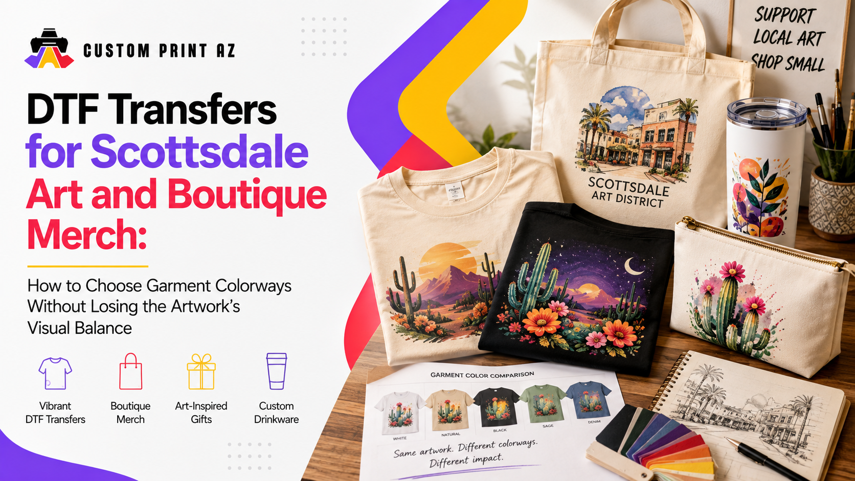
An illustration, poster graphic, or art-led merchandise design can look strong on its original digital canvas. Put that same artwork on a black, cream, white, dark green, or other garment, however, and the composition can feel different. Some garment colors support the artwork, while others can cause important areas to blend into the background, shift the visual focus, or make the overall design feel heavier than intended.
That is why approving the artwork file is not always the last visual decision before ordering DTF transfers. For boutique merchandise and art-led apparel in particular, there is another question to answer: Which garment colorways actually work with this artwork?
The goal is not to redesign a logo, create universal color rules for DTF, or apply the same contrast formula to every design. It is to evaluate existing artwork against different garment backgrounds and determine which garment colors best preserve its visual character.
Do Not Evaluate the Artwork Separately From the Garment
Artwork is often prepared on a white, transparent, or neutral design canvas. The finished product is different. The garment color becomes part of the visual field surrounding the artwork.
This matters especially for illustrations, poster-inspired graphics, and boutique artwork that already contain multiple light, dark, and mid-tone colors. Change the garment color, and some parts of the artwork may appear more dominant while others become less noticeable.
Instead of asking only, “Does the artwork look good?” ask a more useful question: When the artwork and garment are viewed together, does the design still preserve its intended visual character?
If the artwork itself still needs preparation, Custom Print AZ's DTF transfer artwork preparation guide covers the broader design-preparation process. Here, the focus is narrower: evaluating finished artwork against different apparel backgrounds.
Identify What Matters Most in the Artwork First
Before comparing garment colors, identify which parts of the artwork carry the most visual importance. Not every color, shape, or detail serves the same purpose.
In an illustration, the main figure may need to attract attention first. In another design, large typography may carry the entire composition. Some pieces rely on smaller supporting colors, lines, or signature elements to give the artwork its character.
A simple way to evaluate the design is to separate its elements into three general levels:
- Primary visual: The figure, shape, typography, or composition that should attract attention first.
- Supporting elements: Secondary colors and elements that reinforce the primary visual.
- Fine details: Elements that add character when viewed more closely but are not meant to compete with the main visual.
This distinction makes it easier to understand what you are trying to preserve when selecting a garment color. If a background strengthens the main figure but weakens several supporting colors, for example, that may affect whether the combination still represents the artwork the way you intended.
Scottsdale Offers a Real Context for Art-Led Merchandise
This is not purely a hypothetical merchandise scenario for Scottsdale. According to the City of Scottsdale's official city profile, Old Town is home to 320 retail shops and more than 80 art galleries. The city's Old Town Character Area Plan also describes the Scottsdale Arts District as an area that includes fine-art galleries and retail stores.
Those facts do not mean that any particular Scottsdale gallery or boutique uses DTF. They do show that art and retail have a meaningful presence in the same local environment, making the move from original artwork to wearable merchandise a relevant scenario for Scottsdale artists, boutiques, and art-led sellers.
For that type of merchandise, the garment is more than the surface carrying the artwork. The apparel colorway becomes part of how a customer sees the design.
View Dominant Artwork Colors Against the Garment Background
When choosing colorways, avoid treating the entire artwork as one block of color. Look at how its dominant colors interact with each garment background.
If the main figure uses predominantly dark tones, for example, some of its visual boundaries may become less distinct on a very dark garment. If important sections of the design rely heavily on light tones, a very light garment may change how strongly those areas stand apart from their surroundings.
This does not create a universal rule that dark artwork belongs on light garments or vice versa. Every piece has its own palette and composition. The point is to observe how the selected background affects the parts of the artwork that matter most.
For each garment colorway, ask a few simple questions:
- Does your eye still go to the intended part of the artwork first?
- Does a dominant color blend too closely with the garment background?
- Is the overall shape or outer boundary of the artwork still easy to perceive?
- Does the garment color unintentionally make a secondary element feel like the main focus?
- Does the artwork suddenly feel heavier, flatter, or more crowded than it does in the original composition?
These are not printer specifications. They are visual preflight questions designed to help you understand how the artwork behaves once the garment becomes part of the composition.
Remember That Garment Color Can Appear Inside Negative Space
With transparent-background artwork, the garment color does not appear only around the outside of the design. It can also show through transparent areas and spaces between individual shapes. In some artwork, that means the garment itself effectively becomes part of the composition.
Negative space that feels subtle on a light garment, for example, may become a much stronger visual shape on a dark garment. The reverse can happen as well. A garment color can visually connect with open areas inside the artwork and change how certain boundaries are perceived.
When comparing colorways, do not ask only whether a shirt color “looks good” with the artwork. Also consider what the garment color contributes inside the areas where nothing is being printed.
You Do Not Have to Turn Every Garment Color Into a Merchandise Option
Just because an artwork can be placed on many T-shirt or hoodie colors does not mean every combination needs to become part of the merchandise line.
If you review five garment colors and three combinations clearly preserve the artwork better than the others, there is no requirement to force the weaker combinations into the assortment simply to offer more choices.
For art-led or boutique merchandise, a more selective group of colorways can help preserve the identity of the artwork. The more useful question is not, “How many colors can we offer?” It is “Which colors genuinely work with this artwork?”
Sometimes a Second Artwork Variant Makes Sense
Some artwork can move between light and dark garments without requiring a visual change. Other designs may benefit from a small adjustment for a particular garment background.
Before creating multiple files, identify whether the problem actually requires another artwork variant. If the issue is simply a weak garment colorway, removing that garment from the assortment may be the simpler choice. If the garment color is important to the merchandise plan and the artwork can be adapted while preserving its character, a separate production variant may be worth considering.
It can also be useful to keep the original artwork separate from any merchandise-specific variant. That way, the source artwork remains intact while apparel-specific changes have a clear purpose.
Use Mockups as Comparison Tools
Mockups can be useful when evaluating different garment colors, but they should be treated as comparison tools rather than guarantees of an exact final physical result. Their value here is that they make it easier to view the same artwork against several backgrounds.
Looking at four or five garment colorways side by side can reveal differences that are harder to notice when each option is viewed separately. One background may help the primary artwork stand out naturally, while another changes the visual weight of the composition.
Instead of reducing the comparison to “Which one looks best?” consider a few more specific questions:
- Does the primary focus of the artwork remain consistent across the options?
- Which garment colors support the artwork's palette most naturally?
- Where do important color relationships begin to weaken?
- Does one colorway make the artwork feel substantially different from the others?
You do not have to treat every option equally after this comparison. Some garment colors may emerge as strong candidates while others clearly need another look.
Consider the Colorways as a Merchandise Family
Boutique merchandise is often seen as a group rather than as a single isolated product. The same artwork may appear across several garment colors in an online collection, a small apparel drop, or a retail display.
That makes it useful to consider not only whether each colorway works on its own, but also how the selected options look together as a merchandise family.
A garment color that gives the artwork a different visual character is not automatically a bad choice. The important distinction is whether that difference is intentional or simply the result of an unexpected interaction between the artwork and its background.
Once the strongest options are viewed together, it often becomes easier to see which colorways preserve the artwork naturally. Weaker combinations do not need to remain in the assortment solely to increase the number of available choices.
Recheck the Artwork When You Add a New Garment Color
An artwork may already have been approved for a particular set of garment colors. Adding another color later does not automatically mean the previous visual decision applies to the new background as well.
A new garment color does not necessarily require a new design project. In many cases, simply viewing the existing artwork on the new background and checking whether the important color relationships still work is a useful starting point.
This becomes especially relevant when the same artwork returns across seasons or future merchandise drops. The artwork may remain unchanged, but a new garment background creates a new visual combination that deserves its own quick review.
Run a Quick Colorway Preflight Before Ordering
- Identify the part of the artwork that should attract attention first.
- Select the garment colors you are actually considering offering.
- View the artwork on each garment background.
- Check whether dominant colors blend too closely with the background.
- Look at how the garment color appears through transparent and negative-space areas.
- Compare whether the visual weight of the primary artwork changes between options.
- View the colorways side by side.
- Keep the combinations that work most naturally with the artwork.
- For weaker combinations, decide whether removing the garment color or considering an artwork variant makes more sense.
- Review the selected artwork-and-garment combinations once more before ordering transfers.

This preflight is not a printer specification and does not guarantee an exact final color result. Its purpose is simpler: to catch obvious visual conflicts between the artwork and garment background before the transfer order is placed.
Good Colorway Choices Make the Move From Artwork to Merchandise Easier
For art-led merchandise, a good colorway plan is not about offering the largest possible number of garment colors. A more useful goal is to identify the options that preserve the artwork's visual character and work naturally within the merchandise line.
Scottsdale's art and retail environment provides a meaningful local context for this type of merchandise, but the decision still begins with the artwork itself. Understand its palette, primary visual focus, and negative space, then evaluate how each garment background interacts with those elements.
When the artwork and garment colorway are evaluated together, it becomes easier to identify which combinations are ready to move forward as merchandise. Once those colorways are selected, you can explore Custom Print AZ's DTF transfer options for the next step.
The principle is simple: instead of trying to make every garment color fit the artwork, choose the garment colors that genuinely work with it.


