

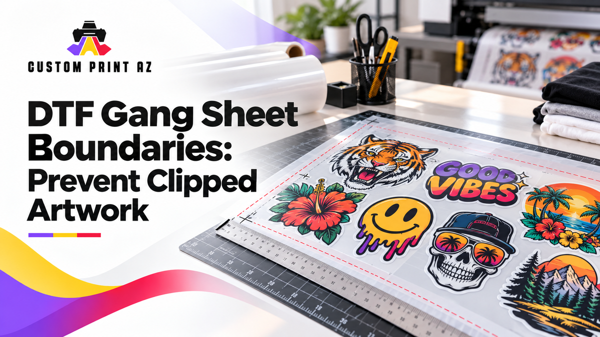
When you build a DTF gang sheet, seeing the design on screen does not necessarily mean it sits completely inside the selected sheet area. The visible artwork may appear correctly positioned while the artwork bounds, transparent canvas, rotation, or a later resize make the final placement harder to judge.
That is why a finished layout should be reviewed with more than one question in mind. Instead of asking only, “Are all of my designs here?” ask: Is every piece of artwork actually inside the selected printable area?
This guide focuses on the relationship between artwork placement and the outer boundary of a DTF gang sheet. The goal is not to fit more designs onto the sheet or create a universal spacing formula. The goal is to establish a consistent preflight process that can help you catch possible clipping or production-layout risks before submitting the file.
Separate the Sheet Boundary From the Artwork Boundary
A gang sheet layout has two different types of boundaries. The first is the outer edge of the selected sheet or printable canvas. The second is the area occupied by each individual piece of artwork.
It is easy to treat those two boundaries as if they were the same. If most of a design appears comfortably inside the sheet, a small area extending beyond the outer edge may be difficult to notice at first glance.
During preflight, the important question is not whether the center of the design sits inside the sheet. The important question is whether the entire artwork remains within the defined printable area.
Because artwork should remain within the printable boundaries of the gang sheet layout, reviewing how every design relates to the outer edge is a useful final step before submission.
Visible Artwork and the File’s Actual Area May Be Different
The visually important part of an artwork file is not always the same as the full area occupied by the file or its selection box.
For example, a logo may look relatively small while the file includes a much larger transparent area around it. The opposite can also happen: an artwork file may be tightly cropped, with visible details extending almost all the way to the edge of its bounding area.
Transparent canvas can make the artwork’s actual bounds harder to judge during placement. A design may look visually compact while the file or selection area extends farther than expected.
This matters because looking only at the center of a logo or illustration may not tell you where the real placement boundary ends. If the layout tool shows a selection box or artwork bounds, use that information along with the visible design when reviewing placement.
The purpose here is not to create a new quality rule for transparent pixels. Transparent canvas matters only because it can affect how clearly you understand the area represented by the artwork during layout.
Recheck the Boundary After Resizing Artwork
A design may be positioned correctly when it is first added to the sheet. After its size changes, however, that original placement may no longer work.
This is especially important for artwork positioned near an outer edge. If the artwork is enlarged, the center of the design may stay in roughly the same place while one side moves closer to—or beyond—the printable boundary.
Do not evaluate a size change only by asking whether the artwork is now the size you want. Ask a second question: At its new size, is the entire design still inside the sheet boundary?
If you need to review the difference between overall sheet size, design size, and final transfer size, DTF Gang Sheet Measurements Explained covers those measurement concepts separately. At this stage, the focus is the final placement of the artwork rather than measurement terminology.
Check the Outer Points Again After Rotation
Rotating artwork can change the area it occupies within the sheet. A design that fits comfortably in a horizontal or vertical position may move closer to an outer boundary once it is rotated.
For that reason, do not evaluate rotation only as a way to use available space. After rotating the design, review its outermost points again and confirm that they remain inside the printable area.
This is especially useful with diagonal artwork. The center of the design may sit clearly inside the sheet while an outer corner or graphic detail comes much closer to the boundary.
There is no reason to invent a universal safety margin here. If a specific outer-margin requirement has not been established for the actual workflow you are using, the correct reference point is the printable boundary shown in the real layout or submission process.
Review Grouped Elements as One Complete Artwork Area
A single transfer design may actually contain several separate elements, such as a logo, text underneath it, a small symbol, or multiple pieces that belong to the same composition.
If those elements are grouped and intended to move together, checking only the position of the largest element may not be enough. The outer bounds of the complete group should be considered.
For example, the main graphic may sit comfortably inside the sheet while a smaller line of text or a decorative element extends much closer to the printable boundary. Because your attention naturally goes to the largest part of the design, smaller elements can be easier to overlook.
During final placement review, it is clearer to evaluate the artwork as the complete group that will be submitted rather than checking only its individual visual components.
Inter-Design Spacing and the Outer Boundary Are Different Problems
The distance between two designs and the distance between a design and the outer edge of the sheet are not the same issue.
Inter-design spacing is about the relationship between neighboring artwork. Outer-boundary control is about whether a design remains inside the printable area of the sheet itself.
A layout can contain designs that appear well separated from one another while the entire arrangement still sits too close to one outer edge. The opposite can also happen: the outer boundary may be fine while two separate designs are positioned very close together.
For that reason, do not assume that a layout with acceptable-looking spacing automatically has correct boundary placement. Treat the two checks separately.
Scan All Four Outer Edges Systematically
On a busy gang sheet, looking at the entire layout at once can make small edge-placement problems easier to miss.
Instead, you can review the outside of the sheet in a consistent order:
- Check the artwork positioned along the top boundary.
- Review the outer edge on the right side.
- Continue along the bottom boundary.
- Finish by reviewing the artwork along the left side.
This is not a new production standard. It is simply a practical review sequence that can make an outer-edge check easier to follow on a long or densely populated sheet.
If the layout contains many repeated logos, scanning the outside perimeter in order may also reduce the need to remember which edge you have already reviewed.
Use the Final Preview as a Separate Checkpoint
Reviewing artwork in the original design program does not eliminate the need for a final layout check before submission.
Preparing the original artwork and building the actual gang sheet are different stages. The artwork file may be correct by itself, but its relationship to the sheet boundary can change after placement or size adjustments are made in the layout.
After making any placement or size changes in the DTF Gang Sheet Builder, review the final layout again before submitting. The important point is to confirm that the artwork still sits fully within the printable boundary shown in the actual layout.
That makes the final preview more than a general visual check. It becomes the last boundary-review checkpoint before submission.
Review the Entire Layout One More Time
After correcting one piece of artwork, it is easy to keep your attention on that single design. Before final submission, however, return to the entire sheet and run one complete review.
The following questions can provide a practical sequence:
- Is every piece of artwork inside the selected sheet area?
- Does any visible element extend beyond the outer boundary?
- Were resized designs checked again after the size change?
- Are the outer points of rotated artwork still inside the sheet?
- Are all parts of grouped artwork inside the boundary?
- Is transparent canvas making any selection area harder to judge?
- Were inter-design spacing and the outer sheet boundary checked separately?
- Does the final preview show any unexpected boundary issue?
This is not a fixed printing specification. It is simply a practical preflight sequence that can help keep final placement review from depending entirely on visual memory.
Do Not Invent a Universal Margin Requirement
One of the easiest mistakes when discussing gang sheet boundaries is to create a fixed edge-margin rule without a verified requirement behind it.
A statement such as “always leave this many inches around the edge” should only be used when the actual production or builder instructions clearly establish that requirement.
The goal of this guide is not to create a universal spacing standard. The better approach is to use the actual sheet dimensions and the printable area shown in the layout you are preparing, then confirm that the artwork stays inside those boundaries.
This keeps the review tied to the real layout you are submitting rather than to an assumed measurement.
The Goal of Boundary Review Is to Catch Risk Before Submission
Checking DTF gang sheet boundaries is different from trying to maximize the number of designs that fit on a sheet. The purpose is to confirm that each piece of artwork remains correctly positioned within the printable area after the layout is complete.
If artwork extends beyond the printable boundary, it may create a clipping or production-layout risk. The safer approach is to correct the placement before submission rather than assume the out-of-bounds area will be handled automatically.
Reviewing the visible artwork, the full bounds, the position after resizing or rotation, grouped elements, and the outer edges of the sheet can make this process easier to manage.
The key distinction is simple: a layout that looks generally correct on screen is not necessarily the same as a layout that has been checked against its actual boundary. A short outer-boundary review before submission can help identify potential clipping or layout problems before they move further into the production workflow.


