

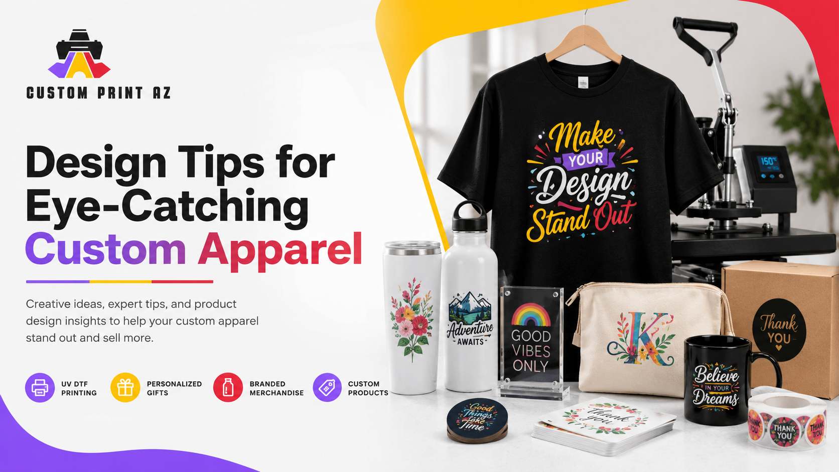
Design Tips for Eye-Catching Custom Apparel
Standing out in the modern fashion landscape requires a clever mix of creativity and structural planning. The fast-paced custom clothing market rewards designers who understand contemporary visual communication rules. If your graphic structures lack balance, your merchandise will simply blend into the retail background.
Modern direct-to-film creation methods give independent brands incredible artistic freedom. You can print complex multi-colored graphic systems without old technical limits. However, beautiful printing equipment still requires intelligent file preparation. This extensive guide teaches you how to design unforgettable, retail-ready custom apparel paths.
Creative Guide Roadmap
- 1. Establishing Dynamic Visual Hierarchy in Fabric Layouts
- 2. Applying Color Theory for Maximum Fabric Impact
- 3. Typography Selection Rules for Clear On-Garment Reading
- 4. Structural Placement Strategies and Garment Scaling Secrets
- 5. Leveraging Negative Space to Improve Wearable Contrast
- 6. Fine-Tuning Digital Resolutions for Industrial Film Production
- 7. Sourcing Premium Commercial Transfers Online
1. Establishing Dynamic Visual Hierarchy in Fabric Layouts
Every successful custom t-shirt layout relies on a clear focal point. The human brain naturally looks for a central anchoring point when viewing a graphic canvas. If too many design details scream for equal attention, your message gets lost entirely.
Make your primary brand emblem or central text phrase the largest element. Secondary details like location lines, founding dates, or subheadings should look visibly smaller. This structural size contrast guides the viewer's eyes through your artwork in a logical sequence.
A balanced layout layout organizes your graphics gracefully to tell a distinct brand story. Consider how different elements interact across the chest area of your apparel. Use size, thickness, and color weight to direct attention exactly where you want it most.
Understanding basic visual communication theories will improve your garment brand layouts significantly. Explore the core principles of visual hierarchy on Wikipedia for a deeper look at professional layout strategies.
2. Applying Color Theory for Maximum Fabric Impact
Selecting the right color palette is critical when designing physical apparel items. Your digital artwork shades must look beautiful against the actual fabric backdrop. A brilliant design can fail completely if it lacks proper color contrast against the shirt.
Complementary color sets use opposite shades on the color wheel to generate maximum visual energy. Combining bright yellow artwork with dark purple hoodies creates an eye-catching, high-contrast look. Conversely, low-contrast combinations can make your text elements look muddy and hard to read.
| Fabric Color Base | Recommended Contrast Graphic Shades | Shades to Avoid Completely |
|---|---|---|
| Deep Obsidian Black | Bright White, Electric Gold, Neon Pink, Soft Pastel Cream | Dark Charcoal, Midnight Navy, Deep Forest Green |
| Classic Athletic Heather Gray | Bold Black, Rich Royal Blue, Vibrant Crimson Red | Light Pastel Silver, Faint Yellow, Muted White |
| Pure Clean Soft White | Jet Black, Deep Plum Navy, Emerald Green, Intense Orange | Light Peach, Pale Yellow, Faint Pastel Tan Shades |
| Vintage Navy Blue | Crisp White, Warm Sunset Orange, Bright Lemon Yellow | Dark Slate Gray, Deep Chocolate Brown, Dark Maroon |
Convert your active digital design artboards into the CMYK color space early in your process. This step shows how your glowing digital screen pixels will translate onto physical clothing inks. It allows you to adjust dull color values before starting production.
3. Typography Selection Rules for Clear On-Garment Reading
The font choices you select define the overall personality of your apparel brand. Bold sans-serif typefaces project a clean, modern, and high-energy athletic style. Elegant script lettering creates a sophisticated, premium boutique feel on custom clothing.
Avoid using overly distressed or microscopic script elements on small sleeve logos. Very thin font lines may not hold enough adhesive powder during production. If a text line lacks adhesive, it can peel away during standard washing machine cycles.
Maintain a minimum line thickness of 0.02 inches for all your printed text assets. Always convert your text layers into solid vector paths before saving your files. Turning text into paths prevents font distortion errors if your print shop lacks your exact font.
The Importance of Text Contrast
Never let decorative font outlines crowd your main words. Give your letters plenty of breathing room by adjusting tracking and kerning values carefully. Proper spacing ensures your text remains highly readable from across a room.
4. Structural Placement Strategies and Garment Scaling Secrets
A beautiful design graphic looks awkward if it is placed poorly on a garment. Standard center-chest prints should sit approximately three inches below the collar seam line. Placing a large chest logo too low results in an unflattering stomach placement.
Scale your graphic files carefully to fit your actual garment size distribution. A large twelve-inch design looks perfect on an adult extra-large hoodie. However, that same giant print will overwhelm a small toddler shirt or a fitted women's tank top.
Consider splitting your print run sizes if you cater to diverse body shapes. Use smaller graphic options for smaller garments to keep your product lines looking consistent. This extra step gives your entire inventory a polished, retail-ready finish.
5. Leveraging Negative Space to Improve Wearable Contrast
Beginner designers often crowd their garment canvases with too many heavy design elements. This approach results in a heavy, stiff layer of ink that feels uncomfortable to wear. Premium apparel design relies heavily on utilizing open, negative spaces.
Let the natural fabric color peek through open areas of your custom layout. This strategy lowers ink consumption and gives the garment a soft, breathable texture. It ensures your custom apparel stays lightweight and comfortable to wear during warm weather.
Softening Complex Graphics
Break up large, solid blocks of ink with fine distressed textures or clear cutouts. This technique helps large graphics blend into the fabric look naturally. It creates a comfortable, premium vintage retail texture.
6. Fine-Tuning Digital Resolutions for Industrial Film Production
Your finished physical apparel quality depends entirely on your digital file preparation. Never use low-resolution internet images for commercial clothing production. Your working artboards must utilize a setting of 300 dots per inch minimum.
Ensure your design background layer is completely transparent before exporting files. Any lingering white background blocks will print as solid shapes on your apparel. Use hard masking tools to clear away faint, stray background pixels cleanly.
Save your final work as a high-resolution Portable Network Graphics file with alpha transparency enabled. This format preserves clean, see-through background layers around your shapes perfectly. It ensures the machine prints only your intentional design elements.
7. Sourcing Premium Commercial Transfers Online
Once your custom apparel designs are flawless, select a premier manufacturing partner. Sourcing from a top-tier print house guarantees excellent color depth and wash durability. Look for a team that utilizes industrial-grade systems for every single run.
We highly suggest working with the digital garment specialists at Custom Print AZ. Their advanced production hub maintains strict quality benchmarks for every order. They make uploading your custom artwork files simple and straightforward.
You can browse their specialized print options directly from your browser. Explore their commercial catalog of high-durability DTF transfers online. This flexible system handles small custom family projects and large corporate apparel runs with equal precision.
Partnering with an industry leader streamlines your apparel manufacturing workflow perfectly. It eliminates the high cost of buying machinery and dealing with daily printhead maintenance. It leaves you free to focus entirely on building your custom apparel brand and connecting with your audience.
Bring Your Eye-Catching Custom Apparel to Life
Stop settling for dull, low-quality custom prints that crack and fade after a few washes. Switch to high-efficiency, commercial-grade custom gang sheets and make your brand stand out.
Partner with Custom Print AZ and explore the premium DTF transfers collection today.
Order Your Custom Transfers Now

